2D UI scaling on large and small screens

I would like to learn ways I could implement the UI screen using the 2D Screen system of the engine. The game can be run on both PC browsers and phone devices, so ideally it should scale and maintain relative position of the elements accordingly.

Here is my current Home Screen view of the game, which uses my current attempt:

image

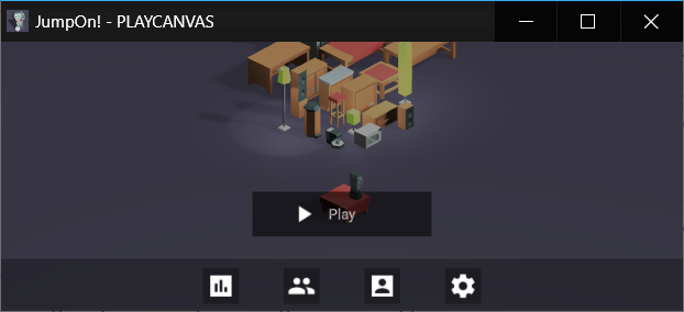
The bottom tint, is a semi-transparent Image Element, which I use as a footer. You can see the hierarchy here:

That footer background is set so that it is always at the bottom and takes 20% of the screen height:
image

The buttons use that footer tint as a parent to position themselves on the screen. They simply try to be at the center of it. They are all grouped inside a Group Element, which has a Group Layout component. This makes them align themselves horizontally and evenly space out from each other. I placed the Play button as a child of that footer too and simply offset it higher, so it is always at the same position relative to the footer, no matter the screen size.

This works well on mobile devices, no matter how I orient the device. However, I am facing an issue of properly scaling it on a PC monitor. The screenshot will not give it a justice, but you can open my game in fullscreen and see what I am referring to.

The buttons have a fixed width and height, which scales if I resize the window. It works well if I scale down - the footer maintains its 20% width, the buttons remain themselves in the center of it and scale down. However, if I go fullscreen on PC, the same process goes the other way around - the footer remains its 20%, the buttons keep their relative positions, but scale up, way over initial size.

In most of my views I keep the relative position of the elements as anchors or sort of guide where the element should position itself. However, when the scale factor goes over 1.0, the elements can easily go out of screen:

In GLSL language there is a clamp function, which clamps the value between further values, e.g. between 0 and 1. Is there a way to achieve a similar functionality with the elements? For example, to clamp its scale between 0.5 and 1.0. In other words, “Hey, element, I don’t mind you to scale, but do not scale over 1.0 if you are growing”.

I also tried to experiment with keeping positions relative to the center/top/bottom of the screen, but it didn’t go well. In the last screen, for example, the Back button is relative the bottom of the screen and not part of the leaderboard, but it overlaps it, because leaderboard element is relative to the center of the screen.

How do you handle scaling?

1 Like

Hi @LeXXik,

I am not sure what would be the proposed way of solving this, one thing comes to my mind to try (though most likely you would have tried it already):

  • Increasing the width of the ref. resolution on the parent 2D screen so you have a bigger range supported.

Apart from that, if nothing works there is the “ugly” way of doing this: provide to separate screens with different layouts to support both cases (mobile vs desktop). Much like CSS breakpoints on responsive web design.

Hi, @Leonidas

I guess, there is no silver bullet, like Flex system in HTML/CSS. That would have been nice.
Thank you for the suggestions, though. I also thought making different views, and show them based on the canvas size. However, that is indeed a dirty method and will require lots of extra views, so I decided to keep it as a very last resort. I’d rather sacrifice somewhere, like allow to overlap non-critical elements, but keep a single view for every device.

Changing the parent’s size gave me some additional ideas, though. Thanks! It kind of slipped through me. I will experiment with and post my findings if the results are good.

1 Like

Hi Both,

I was investigating this problem too. I’m having a hard time understanding how different I can style a piece of UI graphics depending on if the users comes in on portrait mobile vs landscape desktop.

Is there any way of using something equipvalent of @media breakpoints as in CSS when catering for different devices?

Typically developers will have separate layouts for portrait and landscape view and switch between them if the width/height changes.

This can make data binding a bit trickier as you would have to keep the ‘view’ separate from the logic and data.

Hi,

I see, so, in reality what could that mean? Could I for example have two separate 2D-screen UI entities and switch between their enabled-state based on window.innerWidth or some other flag, for example navigator.userAgent?

image

I see how that could make it trickier to load data, I’ll se what I can figure out there.

1 Like

I feel like this is an area, where we simply try what works for our use case, but haven’t come up with a “silver bullet” yet. If you find a way that fits your case, it would be interesting to learn about.

Anytime, for different orientation needs separate UI. Separate data & view - is a base technique for app, bigger than helloworld.

Thanks guys. I see, no silver bullet. I’ll keep trying to go down the UI framework road until I hit a dead end and might revert to HTML+CSS.

Right now, I have this issue - and I assume I’m missing something primary here, but I can’t get ahold of my entity when I’m inside the event listener for resize

What am I missing? this.entity report undefined


// initialize code called once per entity
DeviceDetection.prototype.initialize = function() {
    
    
    // Lister for changes on window.innerWidth
    window.addEventListener("resize", this.onWindowResize, false);
    window.addEventListener("orientationchange", this.onWindowResize, false);

 
};

// update code called every frame
DeviceDetection.prototype.onWindowResize = function() {
   
    // console.log("window width: " + window.innerWidth + ": " + this.widthThreshold);
        
    
    var w = window.innerWidth;
	var h = window.innerHeight;
	console.log(w + " : " + h);

	if(w > h){
		console.log("Desktop mode");
        console.log(this.entity);
        /*this.entity.children[0].enabled = false;
        this.entity.children[1].enabled = true;*/
	}
	else{
		console.log("Mobile portrait mode");
        /*this.entity.children[0].enabled = true;
        this.entity.children[1].enabled = false;*/
	}

};

1 Like

Hi @bjorn.syse,

Try doing this for all your event listeners, it will set the context the script is running:

window.addEventListener("resize", this.onWindowResize.bind(this), false);
window.addEventListener("orientationchange", this.onWindowResize.bind(this), false);
1 Like

Ah, thank you, you’re a real saver!

1 Like

Got this technique to work quite fine btw.

One thing that bugs me however, is the way the screen is not utilized in the best way. The “cube” retains it’s position in the center of the screen, even though this panel pops up on the right side. The panel will not always be visible but instead appear when contextual information exists.

I would prefer it if the camera/cube to reposition itself in the center of what’s left of the screen.

Is it an orbit camera or is the entity rotating?

It’s the orbit-camera script from your examples here.

It’s a tough one if you want the view to be centered properly in the viewable area. I would probably render to a texture and have that sized to the ‘viewable’ area.

This technique but some extra work is needed to have it correctly sized for your use case https://developer.playcanvas.com/en/tutorials/resolution-scaling/

If you were rotating the object, you could get away with moving the camera/object to the right place but the perspective would be slightly off.

Hmm, ok. Rendering to a texture sounds innovative but complex and might come with other caveats.

I guess if I was using HTML+css for that info panel it could be placed next to the playcanvas container div, and make that one shrink in side. Like when you pull up the Developer panel in Chrome. However, then it wouldn’t be situated on top with that nice transparency anymore…

The problem with that effect when you move the model/camera to the side, the perspective would be slightly off. It would as though you were looking at an object straight on and it got moved to the side.

If you are okay with that (maybe the FOV is narrow enough to get away with that), then instead of an orbit camera, you need to rotate the model is read from mouse/touch input.

I see. that would probaby work, maybe look weird. However, I don’t think I can get away with just rotating the model that easily, because I rely on advanced camera movements for the different hotspots:
2020-09-24_10-10-35

You have a few options here:

  • Modify the orbit camera so that it can handle orbiting around an arbitrary point without the camera looking at it
  • Switch it over to rotating an entity and have the model as a child of that entity. That way, you can move pivot point of the rotation.

Both of which do require a decent amount of refactoring of code.

1 Like

Sounds like there is not easy fix then, but thanks a lot for elaborating of the options. I’ll leave it for now, with the knowledge it can be done but at a cost.